
Designing Consistency: Crafting Ospyn’s First Design System
Creating a scalable, documented, and developer-friendly design system for our Organisation.
Role
UI/UX Designer, UI Developer
Team
Nikhil Mohan (Me),
Ospyn UX Team,
Ospyn Front-End Developers,
Timeline
July 2025 - Present
Project Type
In-house Project
Design System
Design Audit
The Problem I Walked Into
When I joined Ospyn, I noticed something repeating on project after project: every designer was reinventing the wheel. Buttons, inputs, spacing, colors — they all varied. Developers were using random hex codes and mismatched spacings. There was no shared “language.” It started costing us time and introducing inconsistencies across our 7+ live banking‐sector client projects (and more incoming). One year of watching this unfold, and I finally proposed: “Let’s build a design system.” My manager green-lit it. The rest of the team? Mostly puzzled. 70% of them didn’t know what “design system” really meant.
My One‐Month Mission
I had 30 days
In that time I was tasked with:
- Creating a style guide (typography, spacing, palettes)
- Conduction UI Audits to find the pattern we use.
- Building UI components in Figma
- Writing the documentation and guidelines Coding the components (React + MUI) so design and dev matched perfectly
It felt ambitious — especially as I was still at “intermediate” level in system building. But the urgency of multi-client projects meant we needed to act.

Building the Foundation
Before jumping into components, I did a UI audit of our existing screens.
I Discovered
- Base font size was often 14px, designers used small fonts rather than large display styles.
- White space was minimal — we needed tighter spacing.
- Color palettes varied wildly per project.
I set the rules to
- Typography: base 14px, simple fonts, no fancy displays.
- Spacing: 4px baseline grid — so everything aligned neatly.
- Colors: Semantic & neutral colors fixed; primary & secondary would vary by client brand.
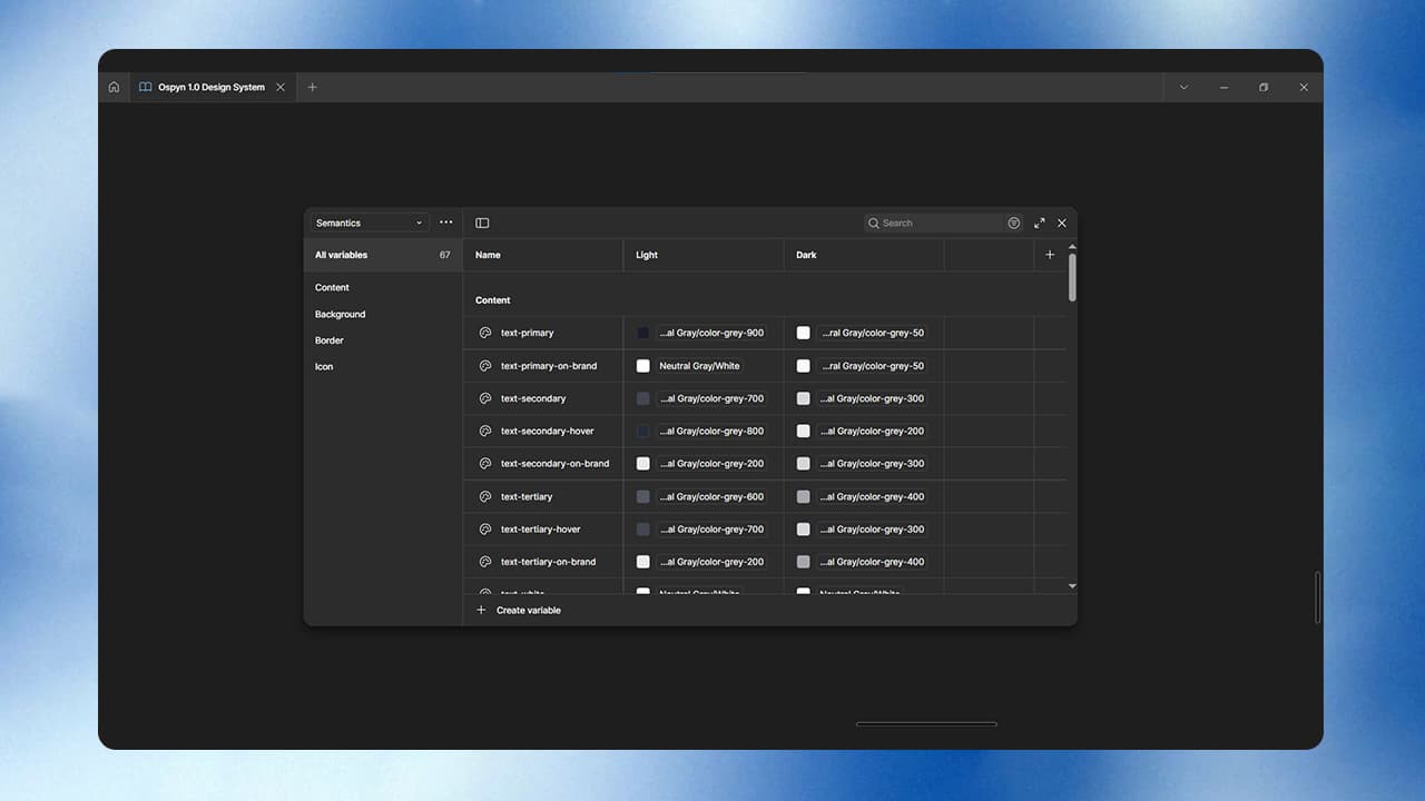
Then in Figma I used Variables, Tokens, and Properties so any designer joining Ospyn could plug into these guidelines and start working.
The foundation was now solid.
Creating Components
With that foundation set, I moved into components.
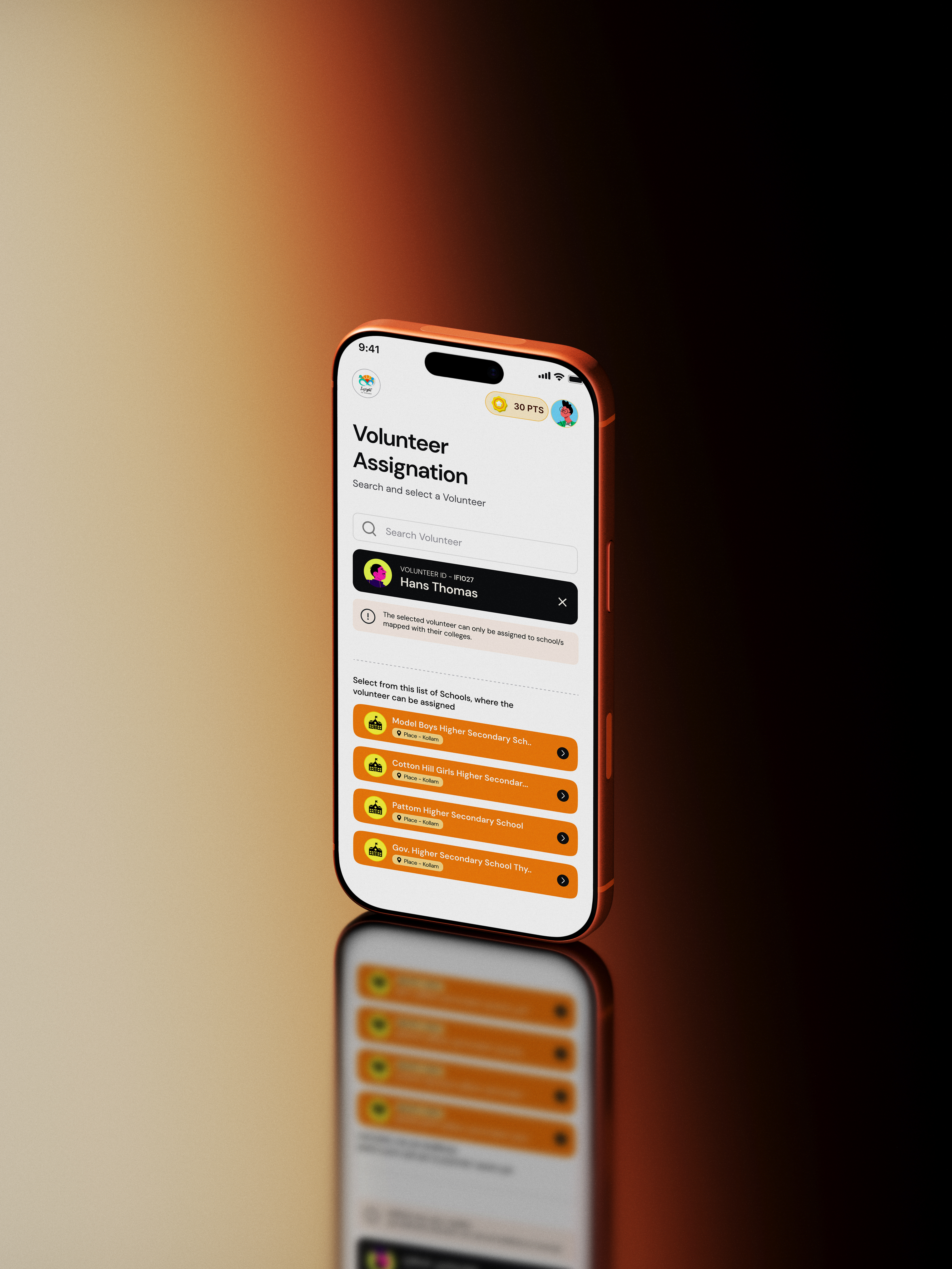
In Figma I built: Buttons, Input Fields, Section Headers — then entire organisms and patterns like forms and sections.
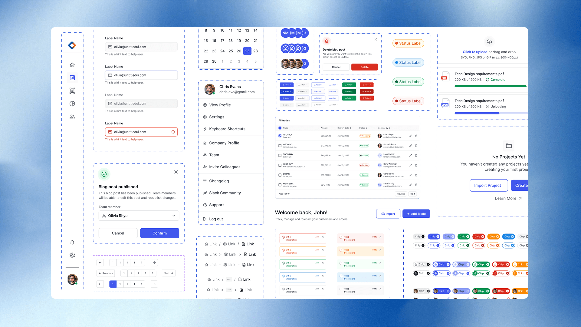
Each component had:
- Usage explanation (“when to use”)
- Anatomy (what parts make up the component)
- Best practices & do’s and don’ts
Then I stored them in organized pages in Figma.
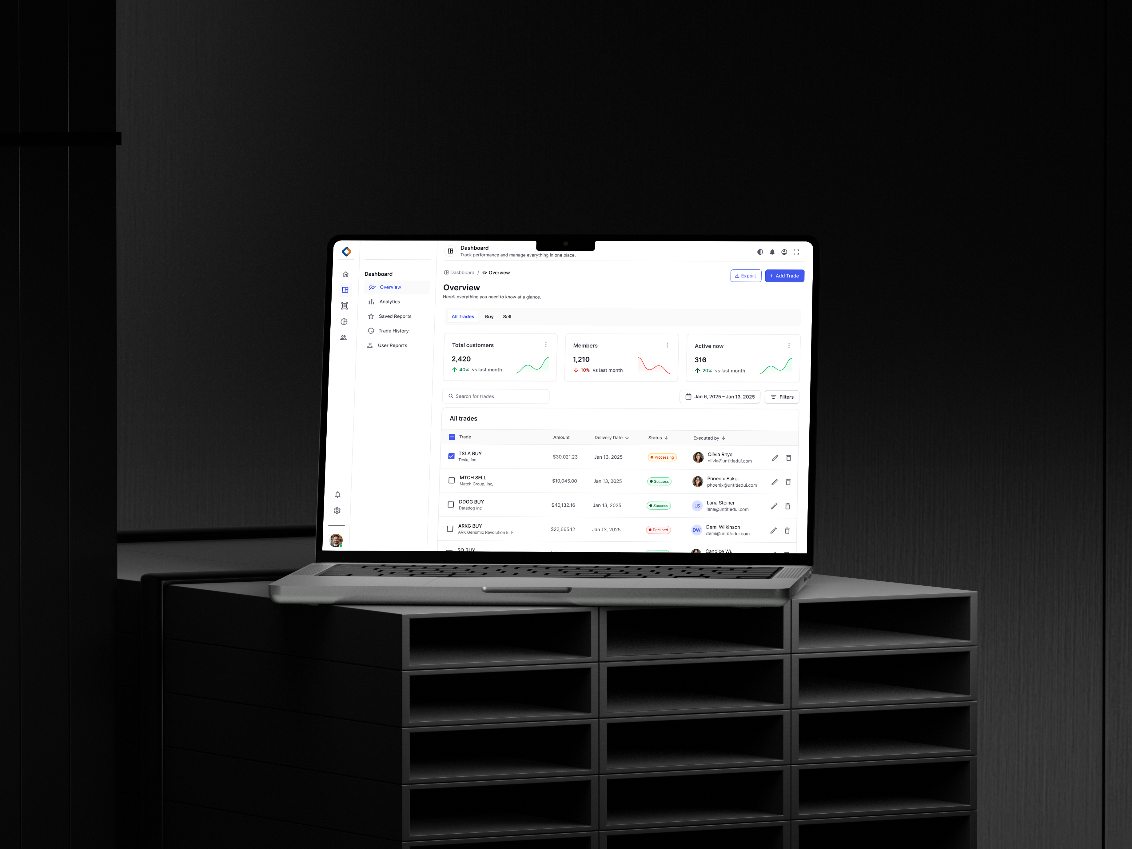
Parallel to this, our dev team started converting components into code. Since we work in React + MUI, we prioritized that stack. I even jumped in and coded a few components using the same to match the specs exactly.
Storybook: The Living Source
The final piece? Storybook.
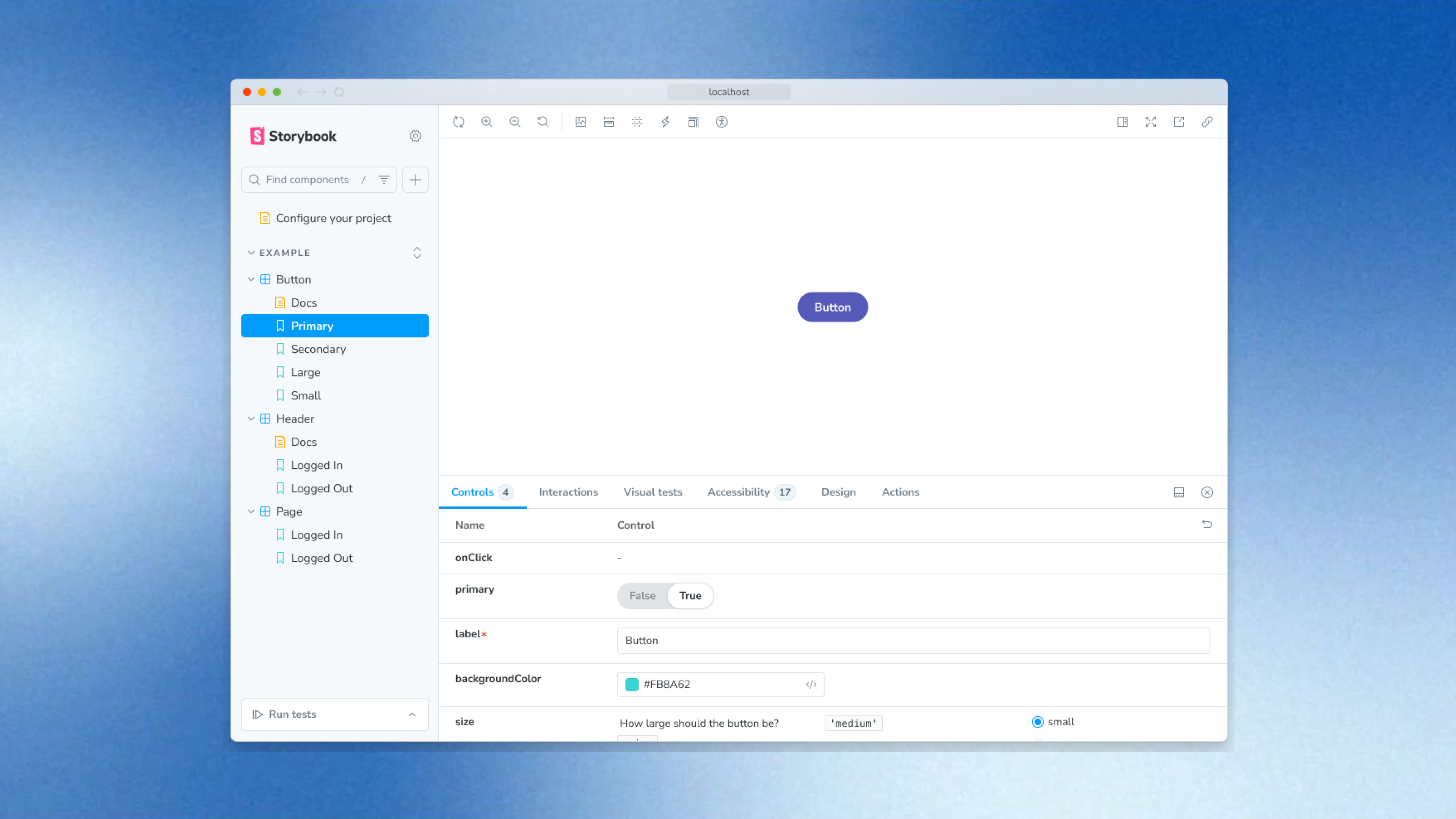
We took all the coded components + documentation and published them in our Storybook-repository. Now:
Designers see live behavior of components
Developers grab ready-to-use code snippets
All documentation, usage guidelines, variants are in one place
It transformed our workflow. What once took days of chasing specs now took minutes of selecting the right component.
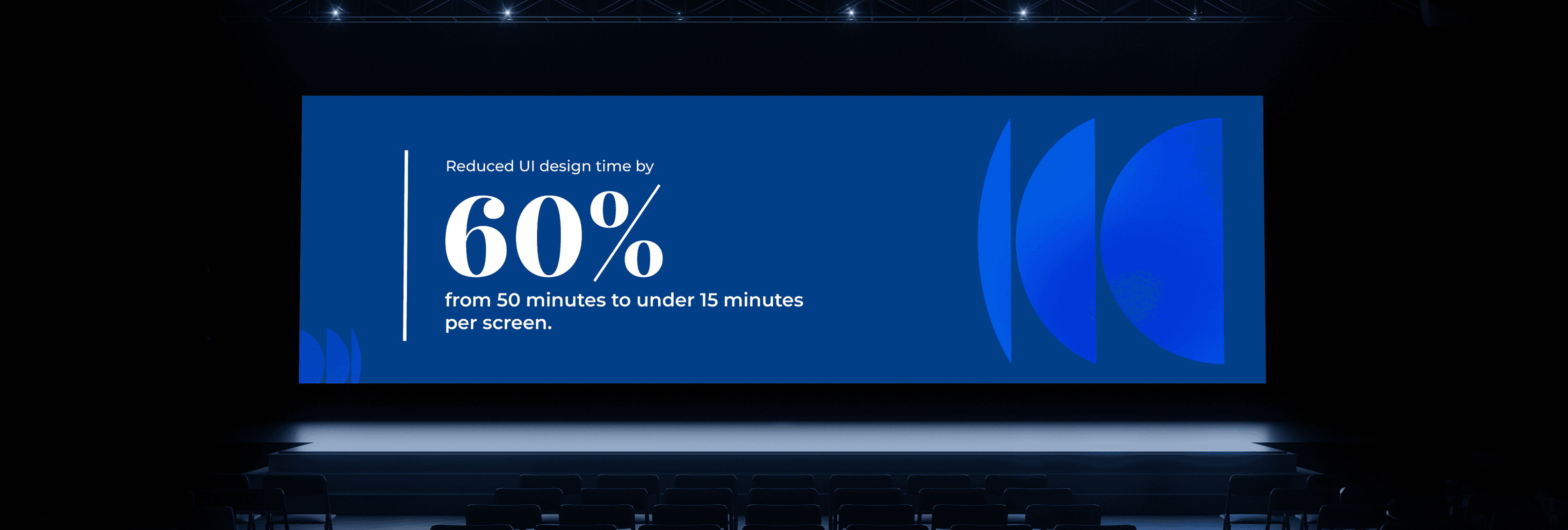
Impacts we created
Delivered 70% faster on new screens (because reuse = speed).
Dramatic drop in inconsistent UI between modules.
Designers and devs now share a single language.
Onboarding a new designer or developer now means “here’s the system — plug in.”
Reflections & Learnings
- A design system isn’t just about components—it’s about process, people, and evolution.
- Understood the importance of Documentation and Naming standards.
- Consistency improves UX and also saves time and cost.
- Gained confidence in Scalable design and Systems thinking.
What I Learned & What’s Next
I learned that building a design system isn’t just about components — it’s about culture change: aligning designers, developers, product owners around one system.
Next step? Open-sourcing parts of the system for internal teams and possibly external contributors.
And iterating constantly — the system grows with the company.